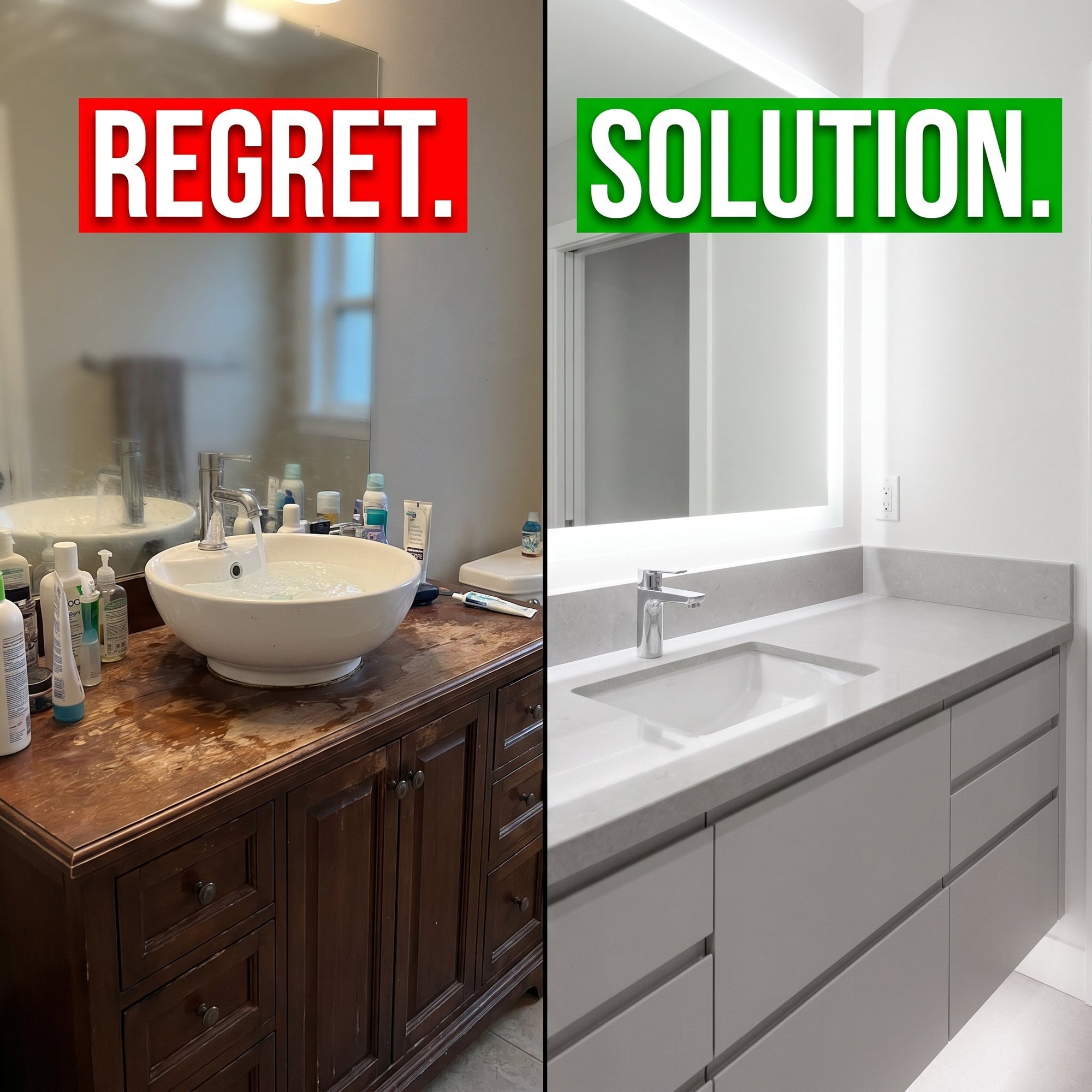




One of the most common frustrations I hear from designers is: “Every piece looked good on its own, but together they just don’t work.” The vanity, tile, countertop, and faucets all come from different places, and without a clear system, the final bathroom feels chaotic. This guide walks you through simple principles of color and material coordination – so you can confidently create cohesive bathrooms that look like they were planned together.
Part 1: Color Principles – Warm, Cool, and the Power of Repetition

- Warm palette: Vanities in natural wood (oak, walnut) or warm beige pair beautifully with cream, beige, or terracotta tiles. Brass or brushed gold fixtures enhance the warmth.
- Cool palette: Gray or white vanities work with blue, green, or cool gray tiles. Chrome or brushed nickel fixtures keep the look crisp.
- The repetition rule: Pick one color from the tile (e.g., a soft gray) and echo it in the vanity finish or countertop. This creates visual flow without being matchy‑matchy.
Pro tip: When in doubt, stick to two main colors and one accent (usually the faucet finish).
Part 2: Material Principles – Balancing Sheen and Texture

- Glossy + Matte: A high‑gloss vanity cabinet feels fresh but can be too reflective if paired with shiny tiles. Balance it with matte floor tiles or a honed countertop.
- Veining direction: If your quartz or marble countertop has a distinct pattern, make sure the veins run consistently (e.g., all vertical or all horizontal). Mismatched directions look unintentional.
- Tile continuity: For a spacious feel, use the same tile on the floor and shower wall, but change the layout (e.g., large format on walls, smaller on floor). Avoid abruptly switching tile families (e.g., Carrara marble to a bright geometric pattern) unless there’s a clear transition element.
Part 3: Three Ready‑to‑Use Pairing Formulas

-
Formula A – Warm Minimalist
Vanity: Light oak veneer with flat panel doors
Countertop: White quartz with fine gray veins
Tile: Large‑format beige matte porcelain
Faucet: Brushed brass or matte black -
Formula B – Cool Spa
Vanity: Soft gray painted wood with shaker doors
Countertop: Solid white or light gray quartz (minimal veining)
Tile: Subway tile in pale blue or sea glass
Faucet: Polished chrome or brushed nickel -
Formula C – Bold Contrast
Vanity: Deep navy or charcoal stained wood
Countertop: White marble‑look quartz with bold veining
Tile: White zellige or simple ceramic (glossy)
Faucet: Polished nickel or unlacquered brass
Part 4: Common Question – “My client already picked the floor tile. How do I match a vanity to it?”

Take a high‑resolution photo of the tile in natural light. Extract the lightest and darkest neutral tones from it. Choose a vanity color that falls within that range – either matching the lightest (safe, airy) or the darkest (dramatic, grounding). Avoid introducing a completely new color family unless you also plan to echo it elsewhere in the room.
Final Thoughts
Coordination doesn’t mean everything comes from one collection. It means understanding how colors, sheens, and textures work together. For your next project, gather samples early and test them side by side in the actual lighting of the bathroom.
If you’d like to see real‑world examples of vanity finishes paired with popular tile colors, visit our inspiration gallery here: Inspiration Gallery. It’s a visual resource designed to help designers and contractors quickly find combinations that work.
Always request physical samples from your supplier before committing to a final design, as screen colors can vary.